When I took on the MySpectrum App rebrand, my first step was research. I audited the existing identity and mapped out where the visual language was falling short—color inconsistencies, accessibility gaps, and a lack of cohesion across touchpoints.
From there, I prototyped different directions, testing typography and color systems against real user flows to see how they held up in practice. Iterations were guided by brand strategy, ensuring the design wasn’t just polished, but purposeful. The final system balanced clarity with flexibility—modernizing the brand while making the app easier, faster, and more intuitive for its users.
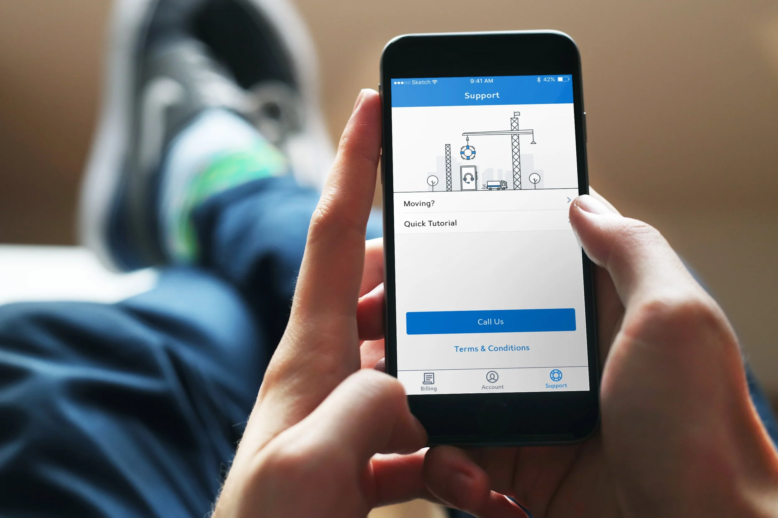
MySpectrum Rebrand
Because our team hadn’t yet adopted a formal design system, I had the opportunity to research and test a new visual language from the ground up. What began as a rebrand for the MySpectrum App grew into the foundation of a scalable design language—one that introduced consistency in color, typography, and components, and ultimately influenced the system later adopted across Spectrum’s web app. This process allowed me to move beyond surface-level brand updates and instead shape a framework that supported long-term cohesion and accessibility across digital platforms.
The rebrand of the MySpectrum App was rooted in a clear goal: to transform a long-standing utility app into a modern, intuitive platform that users could not only rely on, but also feel connected to.
As a team, we set out to unify the visual identity, streamline navigation, and refresh interaction patterns—all while preserving the familiarity that customers had come to trust. It wasn’t just about a new look; it was about creating a seamless bridge between legacy reliability and contemporary usability.
Why the Rebrand
By honoring the old app’s foundation, we introduced a fresh design language and added thoughtful new features, ensuring the experience felt both recognizable and elevated—built with our customers’ needs at the center.

With bill payment as the app’s core feature, we elevated it through a minimal, focused design. Pairing a bold bill amount with a clearly displayed due date simplified decision-making and drove engagement.
Before and After

We refreshed the UI for viewing account numbers, usernames, and contact info, pairing a clean, readable layout with familiar Android and iOS patterns. The result: a modern interface that’s intuitive, accessible, and instantly comfortable for users.
I designed a new icon system that brought consistency and clarity across the mobile app and web platform. This visual language, paired with the refreshed UI, created a cohesive cross‑platform experience.